Smash Guys Burger Kitchen
Bangalore burger brand gets a website that actually matches its product.
We redesigned the core pages — homepage, brand story, digital menu, and locations — to show what the experience could feel like if the site matched the product.
Visual walkthrough
Scroll through the redesign direction.
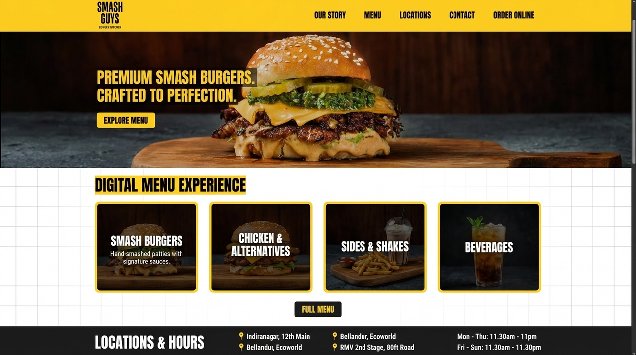
Homepage — full-bleed hero with brand photography, digital menu preview, and a locations footer replacing the original single-screen layout.
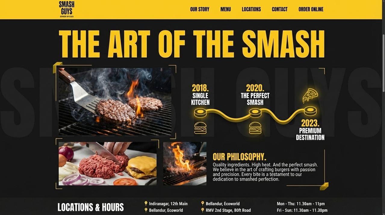
Brand story page — a visual timeline of the Smash Guys journey, designed to build trust and context before a customer makes a decision.
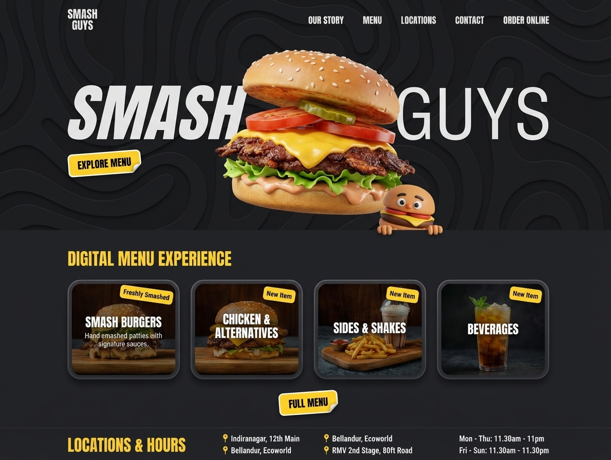
Digital menu — five browsable categories replacing the original PDF download, fully mobile-optimized and consistent with the brand identity.
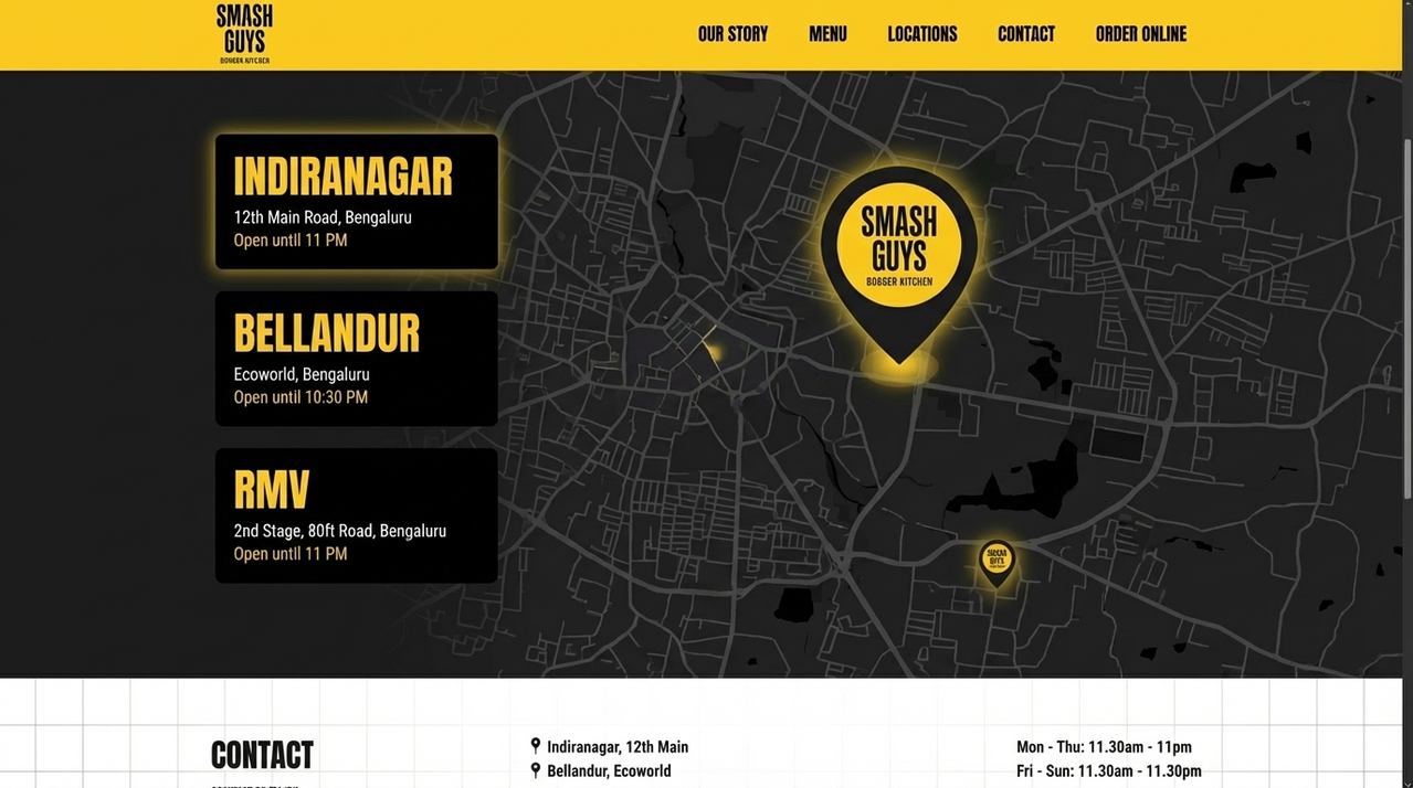
Locations page — Indiranagar, Bellandur, and RMV presented with hours and context, on a dark map that matches the brand aesthetic.
What is included
Built for a fast yes-or-no review.
Homepage redesign with hero, digital menu preview, and locations footer
Brand story page with visual timeline (2018 → 2020 → 2023)
Browsable digital menu — five categories, mobile-optimized
Interactive locations page — Indiranagar, Bellandur Ecoworld, RMV 2nd Stage
Full design system in brand colors — #FFD000 yellow, #111111 black
Cold outreach email written around the concept
Note 1
We started by auditing the current site as a customer would — finding it on Zomato, Googling the brand name, landing on the homepage. The PDF menu was the clearest friction point, and the one most worth solving first.
Note 2
Rather than redesigning from scratch, we kept every existing brand asset — the logo, the yellow-and-black palette, the food photography — and rebuilt the structure around them. The brand did not need a new identity. It needed a better stage.
Note 3
The homepage hero uses their existing burger photography at full bleed. We added a clear CTA, a digital menu section broken into categories, and a locations footer with accurate hours — all the things someone needs when they discover a restaurant online.
Note 4
We chose not to add an online ordering flow because Smash Guys operates primarily through Zomato and Swiggy. The website job is brand credibility and discovery, not transaction. The design reflects that focus.
Contact Relentiv
If this direction feels right, send a note now.
This page is meant for first outreach. The fastest next step is a short message to our team, and we will handle the follow-up from there.
Direct email
hello@relentiv.com